Europe
Europe
Creating a Craigslist Competitor

Craigslist Redesign Project
• People like that Craigslist uses different payment methods.
• It's easy to understand and it's intuitiveness and simplicity make people post more.
•People don’t like how overwhelming it is to find something amongst all the many clickable options and text in general.
•There is no specific notification filters or price watcher to communicate to the user about a new product or price drop.
• Lots of creeps and flakey people.
Person
B

Craigslist User Research:
The mission of this redesign was to create a website that will capitalize on the younger bracket of users in second hand shopping.
Persona for Redesign
Thought Process for Design

Heuristic Review of Craigslist
• Visibility of system status – When navigating the different categories the website does tell you at the top of the menu bar where you are which is good to inform the user about their whereabouts but it’s written very small and doesn’t capitalize locations which makes it hard to interpreate that filter, additionally that location is not intuitive and have to read.. Sometimes the locations that are mentioned in the titles are unclear where they are, and there is no interest to help a user understand their promixity to this item on a map or number detector (they could ask but they don’t, only if you insert it in your profile).
• Match between system and real world – Some concepts aren’t clear to understand like the discussion subform links. Occasionally they use capitalization of location and most of the time they don’t which is pretty confusing when county names can sound like both an item of a category. “save search” is not a clear concept, is it save or is it search and is there an option to do just one? What does save mean in a search menu? Don’t they all save search history? In some pages the categorization isn’t clear, such as with the use of the subcategory “All of”, isn’t that in general the main category without a subcategory?
• User Control and freedom – It does give a page count option which is good and signals to the user something that will help them navigate between the pages, you can also delete or edit a post. However it’s not very clear to the use of the editing page that “continue” means post so it may feel like there is a loose of ability to nagivate freely through this section. The website doesn’t have a build in “Go Back” option, so you would have to do this by clicking the back option from within the browser. You also can’t edit your Craigslist search, you have to delete and start again.
• Consistency and standards: Every word almost on the page is a hyperlink or a basic button except for the different titles which is pretty irregular in other websites. Not clear if when clicking Continue on the button in a posting template if that means it will post.. Learnability of the website could be improved by making these small things clearer. The website doesn’t have a tutorial and the help button is badly placed, so even when you want to make it easy for you to learn, it’s hard. However figuring how to post is very easy.
• Recognition rather than recall – very minimal use of symbols and lots of words. When writing in the search and then wanting to change it and having to delete and rewrite, it’s easy to forget what you wrote before you had to delete it to rewrite. In the locations of headers it always says “X miles away” without adding addition info for what that proximity is referring too (if you move or travel it’s hard to remember what is registered in the location.
• Flexibility and efficency use– while the website does a great job at providing a lot of information and making use of space, it is a bit much and creates an overbearing use experience. It doesn’t provide many accelerators like shortcuts or personalized features that could speed up interaction and make the user feel like the website is tailorerd to help them explore it quickly and efficiently.
• Aesthetic and minimalistic design – not at all aesthetic, no UI and very minimalisic, it’s a genre of basic UX design. But art is not measured so no real evaluation.
• Error Prevention: you can’t go back and fix what you wrote in the search box you have to rewrite it and there is no generated auto correct or assistance in typing ideas (like typing in a similar word and getting a message “Did you mean _?”. Very easily you can click on the wrong thing and only go back through the browser. When you write in plural it doesn’t find the right topic of recommend a similar option, only in singular (in the objects I tried). Additionally I had trouble replying to a Craiglist post and instead got a message that just said “An Error Has Occurred” which isn’t very telling of the kind of error or if users should try again/log in (no call to action or info on which end did the error occur). I wanted to add a search, so I hit "add search". It added a blank search because I didn't realize that "add search" meant "add the search that is above this button" . The website also doesn’t let you change the default location [1 – sorry Craig]
• Help and documentation – The help button is very hard to find, written under the calender and not in an expected location like at the top of the menu page or bottom of the page which hurts the user’s expectation based off previous experience.
Strategy
'
Craigslist already serves its market very well, being inspired by the core values of community, democratizing and defranchising. While Craigslist serves people in many age groups well, we believe having a target audience of younger people from 20-37 will help our growth without competing directly with the Craiglist older clientel, who reverts back to the website because they are used to the design.
The differentiation lays in having a more modern and trust-worthy design initiative in the realm of second-hand online shopping.
Here's an example of a buyer and seller transaction in a flow, for purchasing a flute.

The Phone App


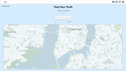
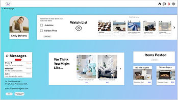
Website
 |  |  |
|---|---|---|
 |  |  |


